03 Jun Creating iconic branding

Whether it’s the use of a certain colour, a simple shape or an object, strong brands and their logos are memorable for one reason or another. The whole point of a notable brand is to be remembered and talked about by everyone.
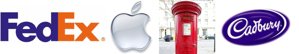
I always remember our design lecturer at university, whilst wearing her iconic bright red boots and standing in front of a large copy of the FedEx logo, she asked us what we noticed about the design. As forty sets of novice designer eyes stared blankly back at her, nobody was going to notice what she was hoping. The hidden arrow created in the white space between the E and the X. Something none of us had ever noticed before, but something that we would now never forget. I know I always remember that day every time a delivery van goes by.
The point of the lecture was to get us to think about the logos we saw everyday and why they looked as they did … the logos that, one day, we would be creating from design briefs ourselves.
So, what is it about some other commonly seen logos? For example the iconic ‘Apple’. This is another favourite from my university days, and reminds me of the time when I first saw a row a brightly coloured ‘macs’ in the design suite – a vision that helped me to fall in love with the technology.
The image of the clean lines of a very simple fruit, with one bite missing! However this wasn’t the first design Apple released for their branding – it began as a more complex picture with Isaac Newton sitting under an apple tree. I’m not sure that such an image would fit on the back of an iPod now or be as easy and simple to recognise as the iconic fruit is today. Whichever colour depicted, you just know that the famous fruit indicates that difference in technology and application that is loved by designers and loathed by PC users. The beautifully elegant, well made ‘Mac’ technology that is in so many homes across the UK and the reason there is always a queue outside their store.
Another of the most easily recognisable brands in the UK – mainly due to its colour is that of Royal Mail. A colour seen on all streets across the UK, the bright red of their post boxes, vans and uniforms allows the brand to be recognised and identified easily. You can spot the postie coming up the road, then you’re eagerly listening for the ring of the doorbell and the wonders of what he or she may be bringing. Maybe it’s an Apple product J. It’s exciting!
Another longstanding, quintessentially British brand is that of Cadbury chocolate. Made in Bourneville, Birmingham, Cadburys is recognised worldwide with its deep, rich purple packaging, which creates uniformity across their different products. Cadbury purple is so recognised that it’s often used as an unofficial description of the gorgeous colour. I know from my days of Saturday wedding shop work that a lot of people would ask for ‘Cadbury purple’ ties and bridesmaid dresses, further popularising this iconic British creation.
The longevity of all of these brands proves the success of their logos and identities, and they’re all still as fresh and recognisable as the day they stepped off the printing line. Yes, they have been refreshed over the years, but they have stood the test of time and are as popular in the market as they always have been, and hopefully always will.
What brands bring back longstanding memories for you?
Sorry, the comment form is closed at this time.