05 Feb What’s your Pantone colour?
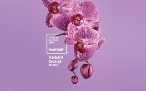
As Pantone announce their Colour of the Year, Radiant Orchid, it led to various updates on Social Media channels giving YOU inspiration to colour your home, wardrobe and life in their chosen shade.
“Radiant Orchid blooms with confidence and magical warmth that intrigues the eye and sparks the imagination. It is an expressive, creative and embracing purple – one that draws you in with its beguiling charm. A captivating harmony of fuchsia, purple and pink undertones, Radiant Orchid emanates great joy, love and health.”
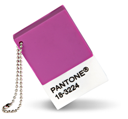
The Pantone colour matching system is a worldwide colour language created to aid the clear communication of colours. A library of colours, all with unique code names and numbers, allows for ease of communication across the world of print and design.
This made me think about the colours in my life. After a busy 12 month house renovation, a baby and a new job, I’ve had quite a colourful year, so to speak.
But looking at the rainbow that is our house I can see a method behind our colour choices that we may not have realised. In the rooms where we spend most time relaxing or sleeping, calm soothing colours have been chosen. From a soft lilac for an inspirational office, to a calm, relaxing fawn to aid relaxation in the main living and sleeping areas. The rooms of more ‘activity’ are a lot more colourful, a welcoming teal coloured hallway, leading through to the room I seem to live in, the kitchen. Dark aubergine coloured walls create a stark contrast to the bright white cupboards, perfect to wake you up on those dark mornings and for inspiring those wonderful kitchen creations.
Then I started to think about the way I use colour in my design work, and how I decide on the most suitable colour. This normally emulates the colour that either represents the packaged item or the most eye catching colour. Not often do I think about a colour’s meaning before placing it into a design. The only part ‘meaning’ plays in colour choice for me is in what type of feeling it creates. A blue creates a cool effect, whereas yellows and reds are more warming, pinks and purples are fun colours and green is bright and fresh, like spring.
I don’t look to others for inspiration on colour – I choose the most appropriate for the subject matter or object.
How do you use colour in your life? Bet you’ve never really thought about it before…
Sources:
http://www.pantone.co.uk/pages/index.aspx?pg=21129
http://www.pantoneview.com/pantone-color-of-the-year-2014


Sorry, the comment form is closed at this time.