05 Feb Trends for 2018
We are only a few weeks in to this new year, but my inbox has already been bombarded by so many emails regarding the “trends for 2018” that we all need to watch out for! Even before the new year started the emails had begun.
Whether it’s “My 2018 font diary”, “The colours to watch out for in 2018” or the latest image or tech trends, you can bet I’ve been emailed about it.
A trend is a general direction in which something is changing, or a fashion, and is a topic that is the subject of many posts on social media. However you interpret the words’ meaning, it’s a popular topic in today’s society. With the rise in social media activity and advertising, trends are being used by brands to interact and engage with their customers. Encouraging people to use certain hashtags, creates ‘trending hashtags’ and so enhances the name of the brand. Clever really when you think about it.
And I suppose that is the same way in which other trends function too. A trending colour will enhance sales of items in that colour and so on, with trending images and fonts etc, let alone non-design related items.
Within the emails I have received have been such topics as trending images, from people such as Shutterstock and Burst, with links through to image searches matching the trends. This makes it really easy for consumers to see these images, think how they could use them and with little more than one click, download the images.
See how it works.
The brands send us the trends to change our way of thinking, they also give us the tools to create the look without thinking too much about it.
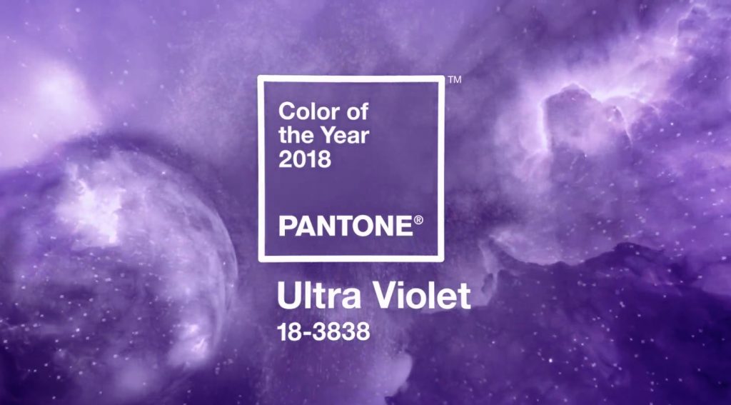
One of the first emails I received was from Pantone, regarding their colour of the year for 2018. I’m pretty sure this arrived way before 2018 started in something like November! So they decided pretty early what their colour would be for the entire year!
Now, I’ve written about the Pantone colour of the year before and how it made me think about colour usage in designs, but how do they choose just one colour for the entire year?
Pantone are influenced by the ever changing worlds around them, carrying out research across the world geographically and across the different media worlds. Firstly they look at the world of fashion, travelling to London, Paris, Milan etc and sampling what colours designers are using there.
Their next step is the world of film. Is there a new large release film due out in that coming year? And what colours and effects will it use if any, that could influence viewers and make them choose certain colours?
Next is cars. Are any new ones due for release? What colours are they available in? Paint used on cars is some of the most advanced and ever changing so it follows that it’s a good influencer for new trending colours.
And lastly the world of art. Is there a new collection on display that has one popular or stand out colour?
With all of these elements to think about, it shows you that they are simply following other people’s trends to blend in themselves. They are not just picking a colour at random. There is a lot of specialist research behind it all.
Pantone colour of the year is PANTONE 18-3838 Ultra Violet
Do any of us actually follow any of these so-called trends? After all, that’s what a trend is isn’t it, creating something for others to follow or replicate? Now you’ve seen this year’s new colour, what do you think about it? Can you see it making an entrance in your lifestyle anywhere?
Is it a ‘yay’ or a ‘nay’? Let us know!


Sorry, the comment form is closed at this time.