
01 Oct Dyslexia and Designing

It is estimated that as many as 1 in 10 people in the UK suffer from Dyslexia or related learning disability. That’s a huge amount of people, but have you ever thought about this when creating your latest design project?
Dyslexia can cause a reader to view your design in a completely different way to the one intended. The choice of fonts, colours, photographs, backgrounds or the way things are laid out, can render the entire thing impossible to understand.
But it’s not an impossible situation. There are steps that can be taken to design for the wider audience and to avoid alienating people.
Dyslexia effects each sufferer in a different way. No two people would have the exact same experience. For some people words are the main problem, for others it is numbers, some people suffer when trying to write and for others it is reading. But whichever is the main factor there are steps that can be taken to make things easier for them all.
So what are the more specific things to think about?
Lets start with font selection. There isn’t just one answer here either. It is not simply the choice of font but the size, weight and style that you choose that could have an impact on readability. “Good” fonts include Helvetica, Courier, Arial, Verdana and Computer Modern Unicode. These are all Sans serif fonts, which tend to be the better choice.
A Sans Serif font is one that does not have extending features called “serifs” at the end of the letter strokes. They tend to have less line width variation and are often used to convey simplicity and modernity or minimalism. Roman fonts also provide a selection of good readability options.
Sometimes it’s not only the type of font but the spacing between the letters, so monospaced font types increase reading performance compared to italic font types which have the opposite effect.
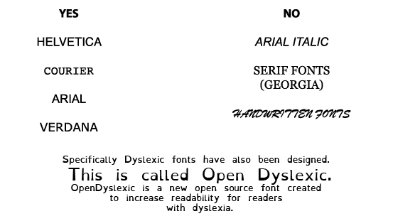
When you look at the list of more suitable fonts displayed above, you can get an idea of where the confusion can come from too. A fancy font, elaborates the letter and adds extra things for the eye to be distracted by, decreasing the readability of the actual letter and ultimately the word.
The same can be said for an Italic or handwritten font. Why make something fancy if it distracts from what you are trying to say?
Sorry, the comment form is closed at this time.